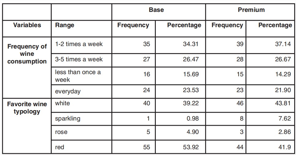
Table 3 highlights that more of the interviewees prefer red wine to white wine, 55 and 40 respondents respectively, while sparkling wine was preferred by only one respondent. More than 60% of the total sample stated that they drink wine at least once a week up to four times a week, while only 15% drink wine less than once a week. (表3显示,更多的受访者更喜欢红酒而不是白葡萄酒,分别有55名和40名受访者,而只有一名受访者更喜欢起泡酒。超过60%的样本表示,他们每周至少喝一次酒,最多一周喝四次,而只有15%的人每周喝少于一次的酒。)
所以同学们在描述表格时需要避免出现这两个问题,要注意到表格呈现的明显信息和数据不要直接描述,而是去解释它。将表格和文本视为两个不同的元素:表格提供信息,文本结合自己的论点对信息进行解释而不是进行直接描述。 所以我们可以这样描述例子的表格内容: Table 3 highlights that there was slight preference for red wine over white wine, and that the sample was essentially made up of regular wine drinkers. These two factors clearly indicate that ... In addition, the fact that only one respondent preferred sparkling wine means that ... (表3强调,人们对红酒比白葡萄酒略有偏好,而且样本基本上是由经常饮用者组成的。这两个因素清楚地表明了... 此外,只有一个受访者喜欢起泡酒这意味着... ) 同学们一定不要忽视表格的重要性,论文需要强力的支撑,很多时候表格提供的信息点会是你构建论据的基石,所以同学们在描述表格结果时也一定要多用心,不要敷衍。